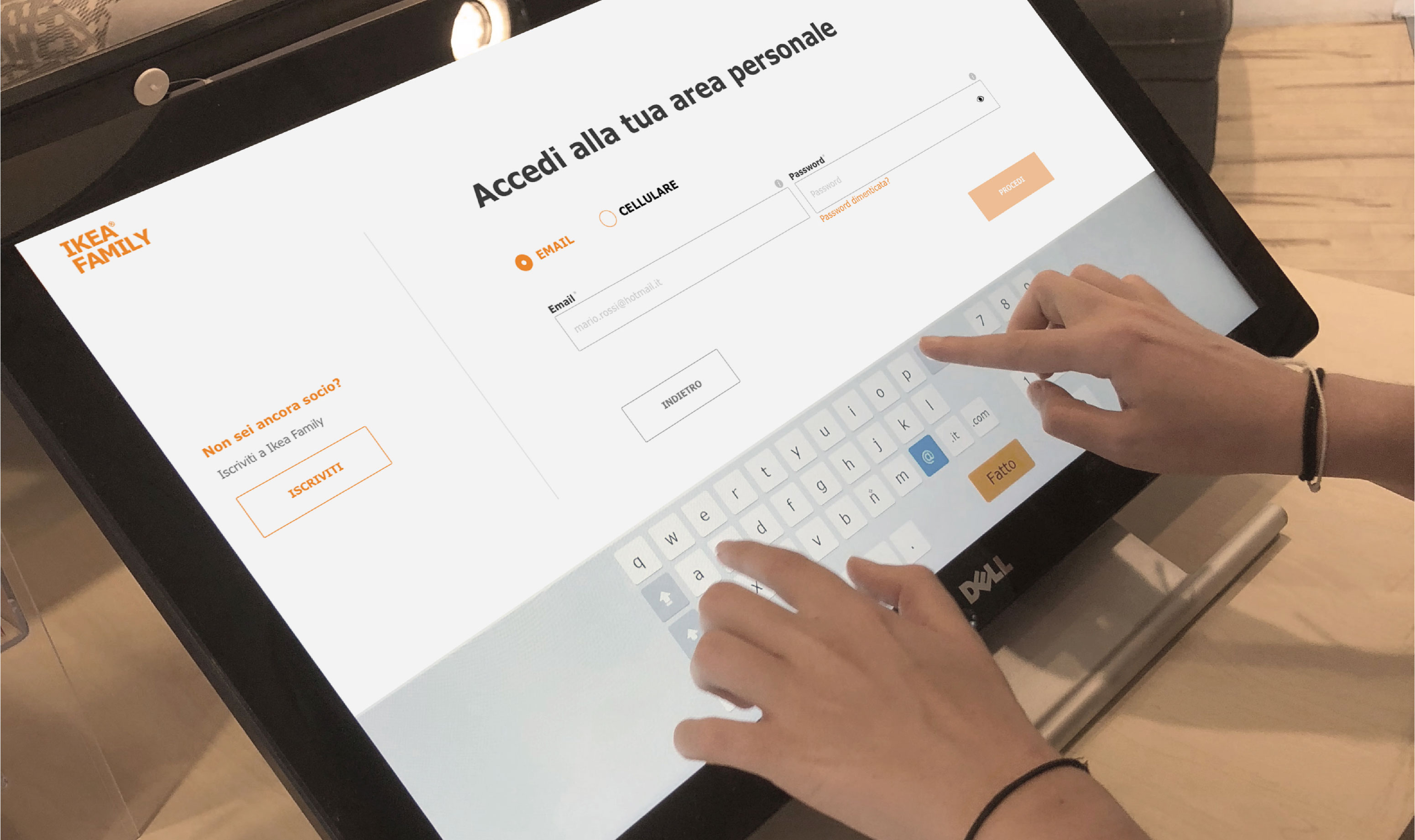
Ikea kiosk user interface redesign
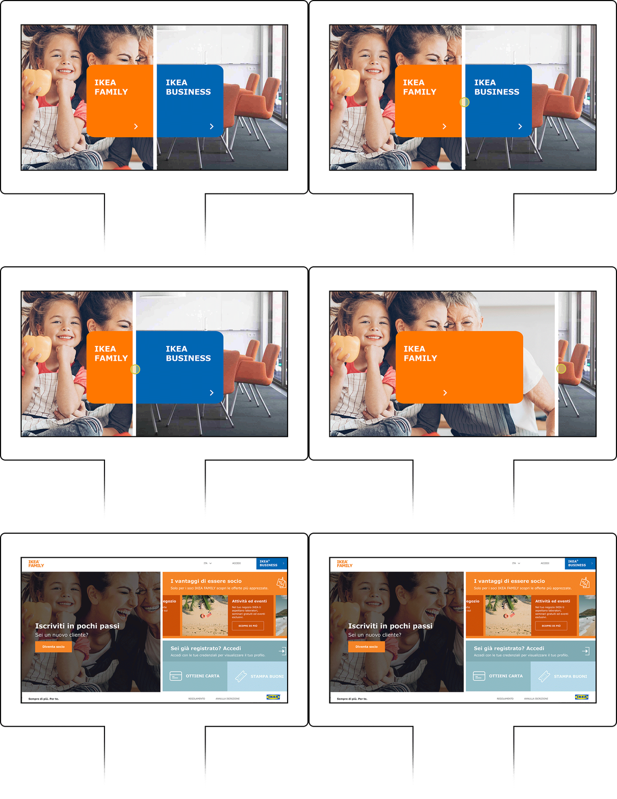
The project consists in the redesign of the interaction and interface of the kiosk 1920×1080 px to improve the ux during the customer loyalty phase through enrollment in ikea family or ikea business.
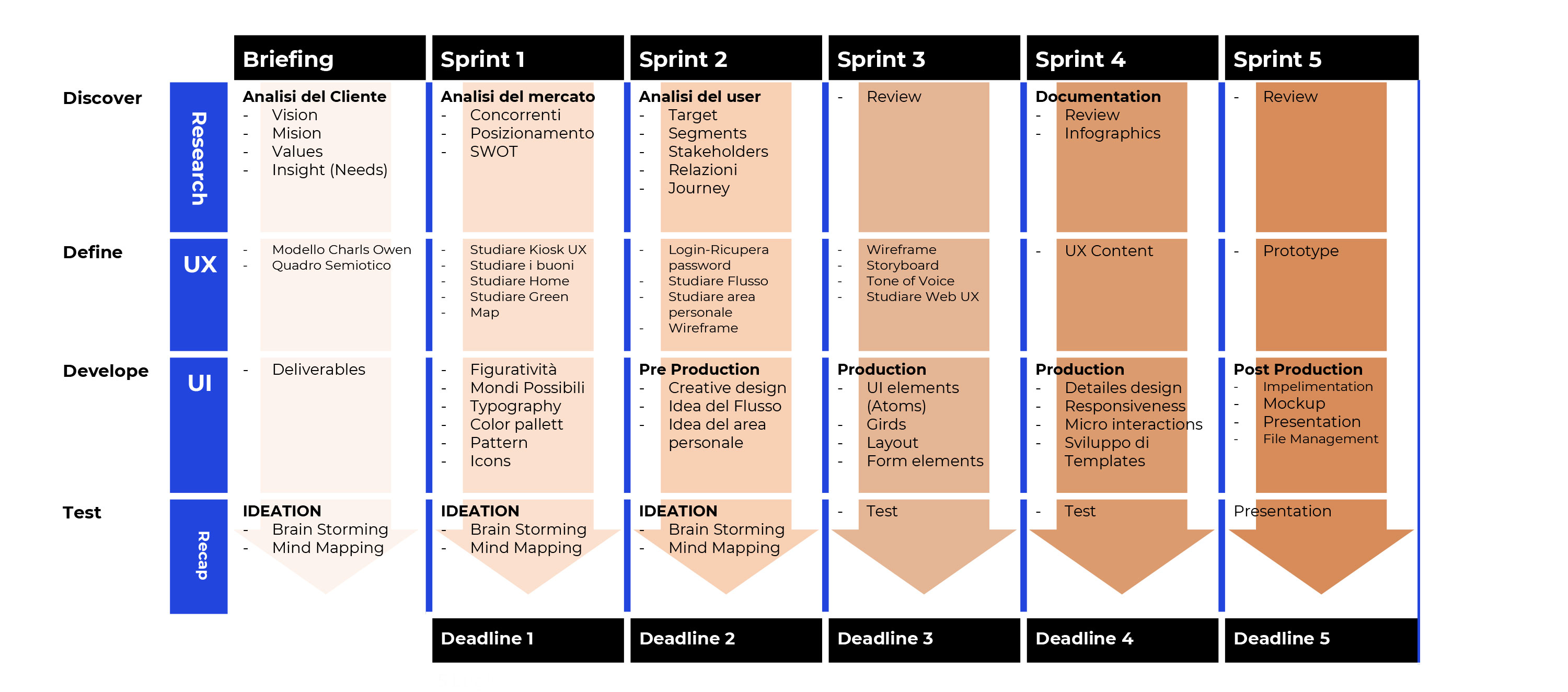
We have used an iterative approach in 60 human days
in 3 main phases of Discover, Define, Design.
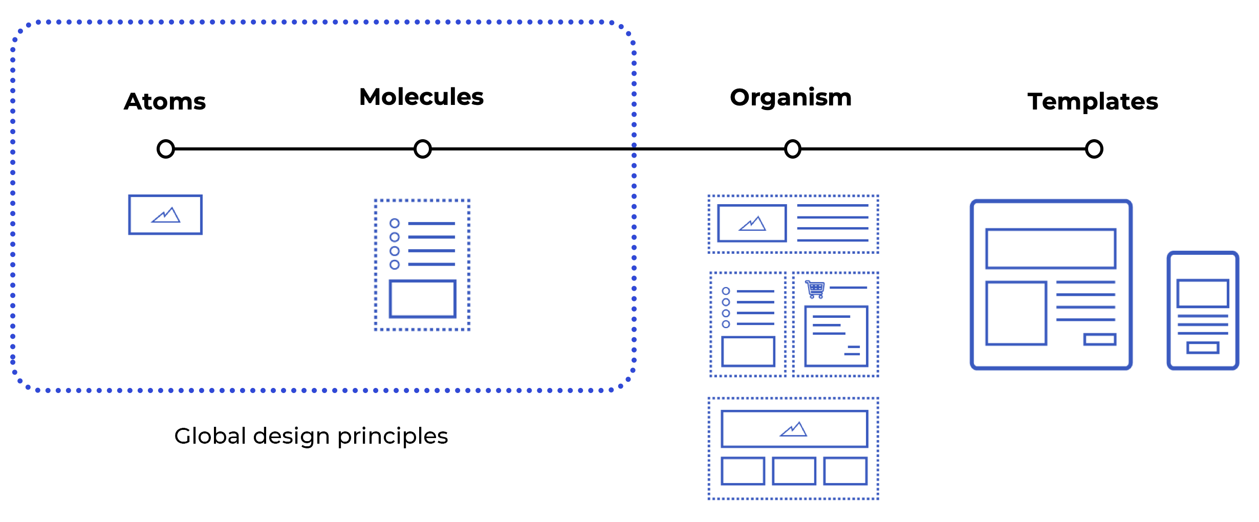
Atomic Approach and hard restyling
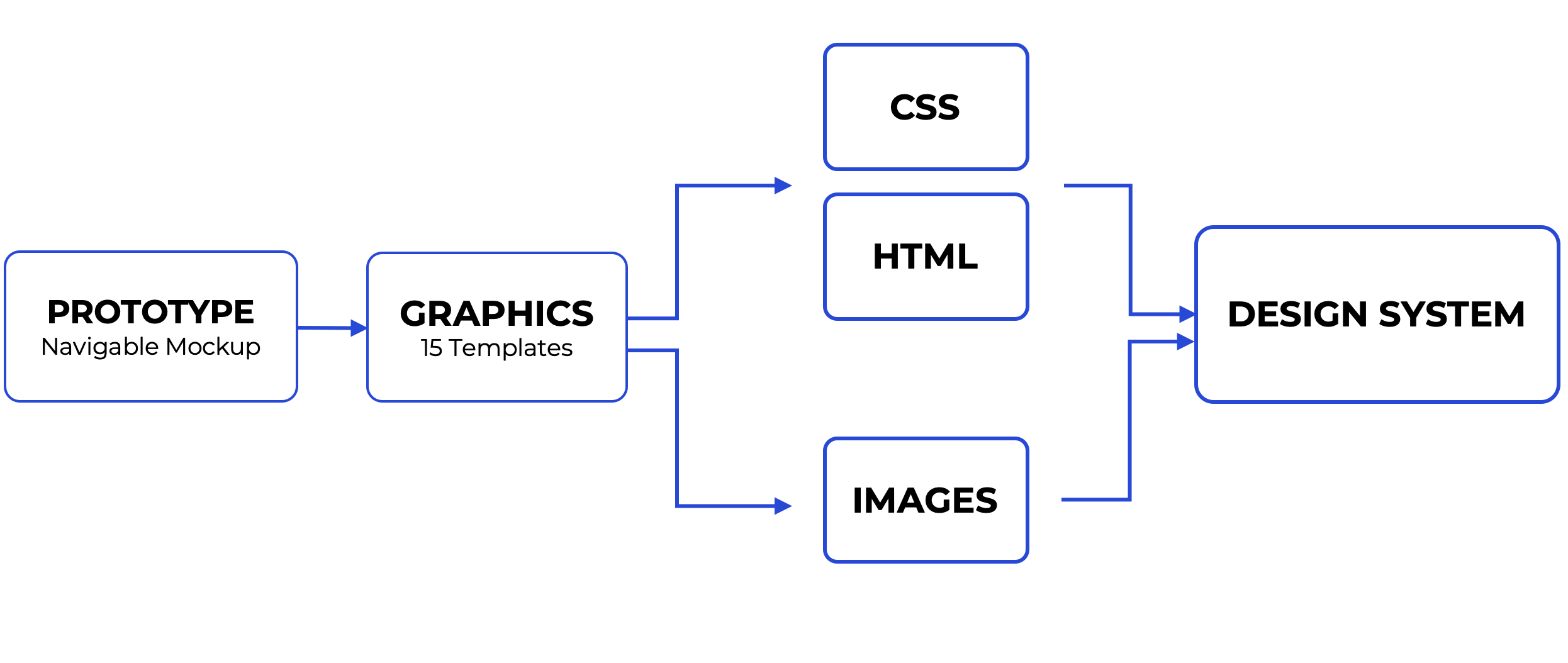
In hard restyling we’ve applied the global rules of IKEA design system, based on the Atomic Design method. We used the same design principles of IKEA developed by Backelite Sweden.
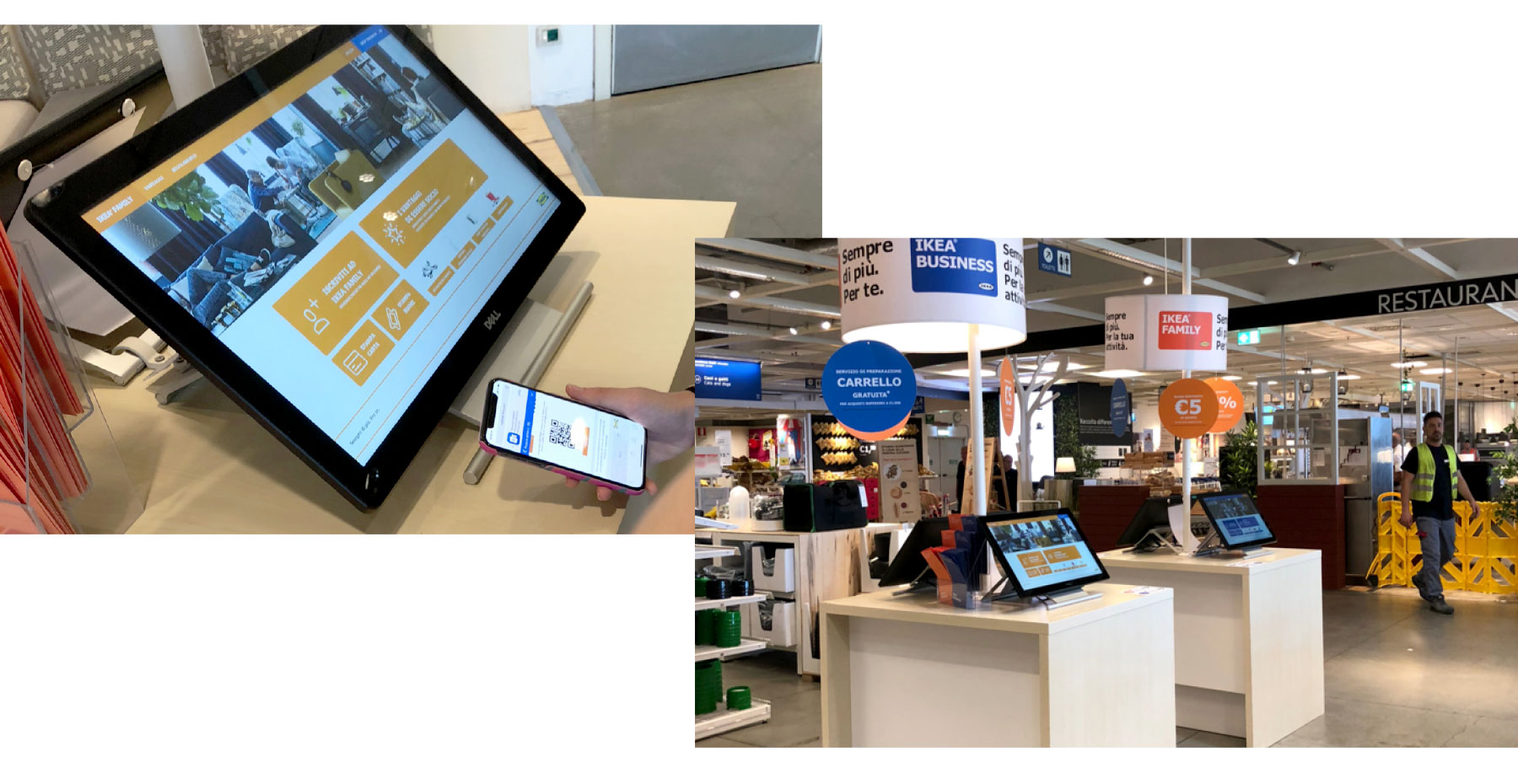
We’ve studied the Kiosk and its behaviour
to design a better experience for loyalty target implementing new functionalities.
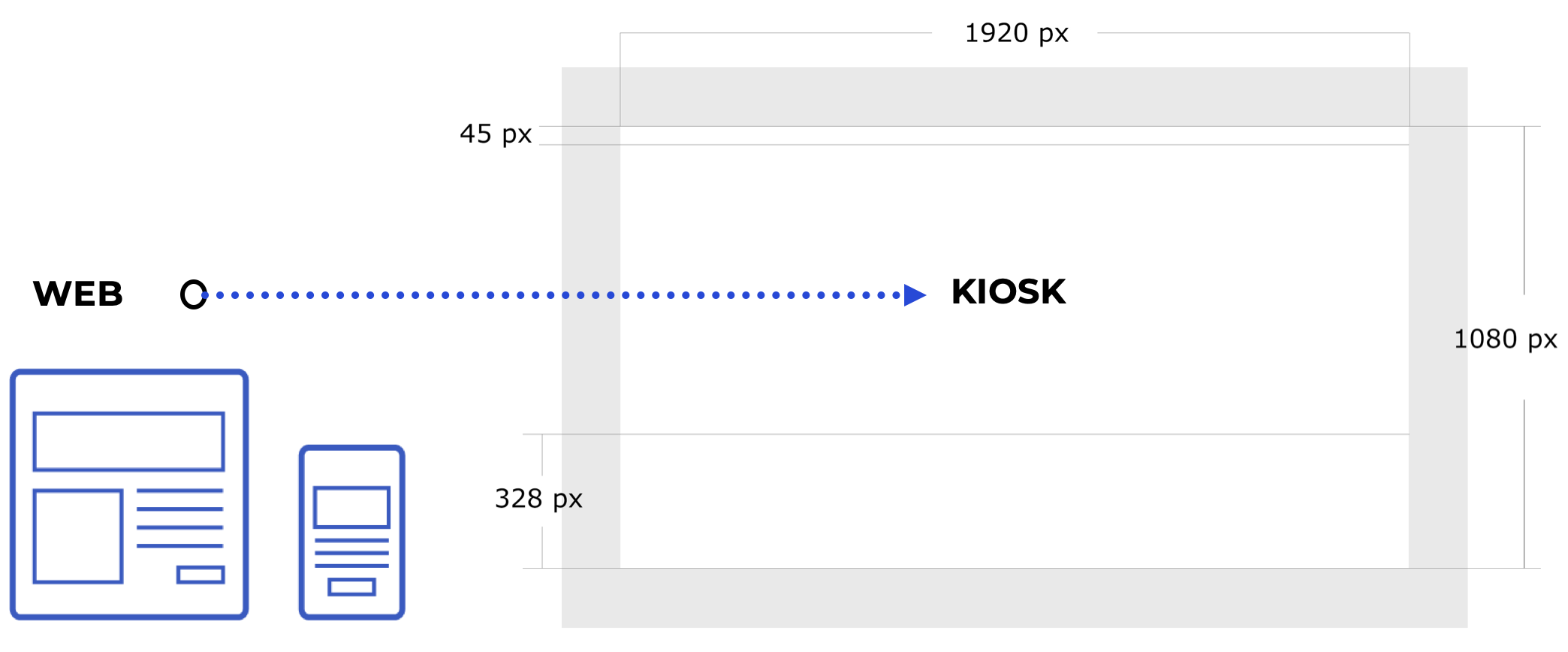
The new user interface was contained of 15 main Components and 5 main templates.


We’ve organised a showcase from the final product that was contested:
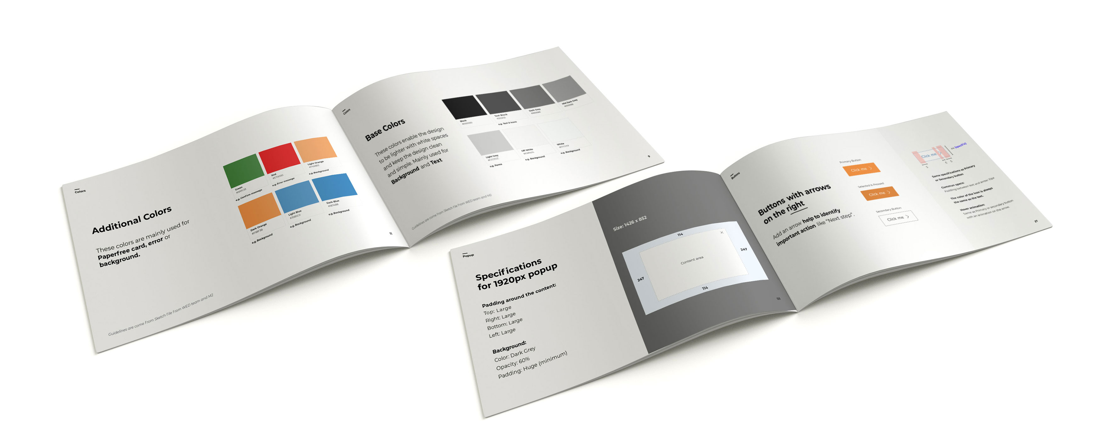
- A Style Guide -as indicated by its name- focused on graphic styles (colours, fonts, illustrations…) and their usage.
- A Pattern Library from functional components and their usage.
We used Zeplin to let developers create resources and code snippets.
